Artwork and campaign materials for a snowboard artist collaboration
MOCK / PRINT / ILLUSTRATION / NAMING /
ANIMATION / PROMOTIONAL MATERIALS
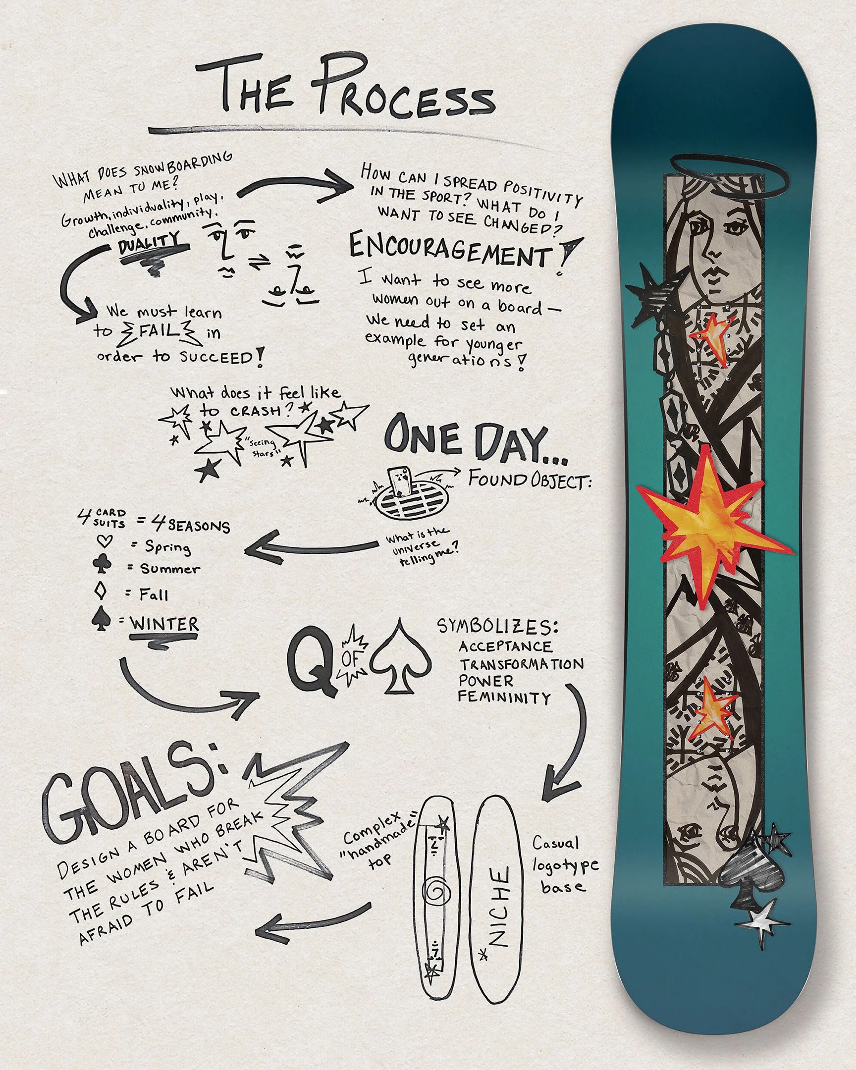
Inspired by my experience learning to snowboard as an adult, Royal Slush encapsulates the feelings of excitement, anxiety, and rush of being on the mountain. Like the experience of learning how to be a graphic designer, failure is part of the process and mistakes are your friends, and that theme runs throughout the design of this snowboard. Imperfect lines, shapes, and scribbles, paired with vibrant bursts of color inspired by the 70s– Royal Slush represents everything I would have wanted to know before I began to learn how to board. I chose to create a * mock * collaboration with the snowboard company *NICHE, a women-founded and operated, 100% environmentally-focused brand. The company aligns with my values and became a perfect opportunity to put my knowledge into practice.
I anticipated my Capstone Exhibition well in advance, constantly brainstorming ideas for what could be a fitting conclusion to my undergraduate studies. As a Graphic Design and Marketing student, I always take notice of unique branding opportunities, and as winter rolled around I got to see the amazing artwork on snowboards and skis each time I went to the mountain.
I knew what I needed to do.


The Queen of Spades is the central motif on the board, symbolic of power, femininity, and transformation through failure. The two ends of the card represent the duality within us– one who succeeds and one who fails– the imperfect nature of all humankind. The bright explosions of star-like shapes are a literal representation of “seeing stars,” when you wipe out, and slide down the mountain in a cloud of snow. The design thinking for this project is illustrated within The Process.
Color Palette
#075452
#208381
Typography
Imperfect and marker like, contrasted with clean sans-serif lines– a duality in all of us.


Print Promo
Deliverables
Bright and bold, just like your personality.
#D86B18
Sticker packs, posters, banners,
and more! For use at in-store displays
and advertising setups.
#FDBF08