Logo proposal for the Billerica Economic Development division
PROPOSAL / BRANDING / IDENTITY
A refreshed logo and brand identity guide for the Economic Development Division of Billerica, Massachusetts. The goal of the redesign was to attract new businesses and families to the growing city.
The client was looking for a brand identity that aligned with the goals of Billerica’s Economic Development team: attracting new businesses, people, and modernizing the town. The target audience included business owners, investors, and younger generations of potential renters and homeowners.
Design Rationale
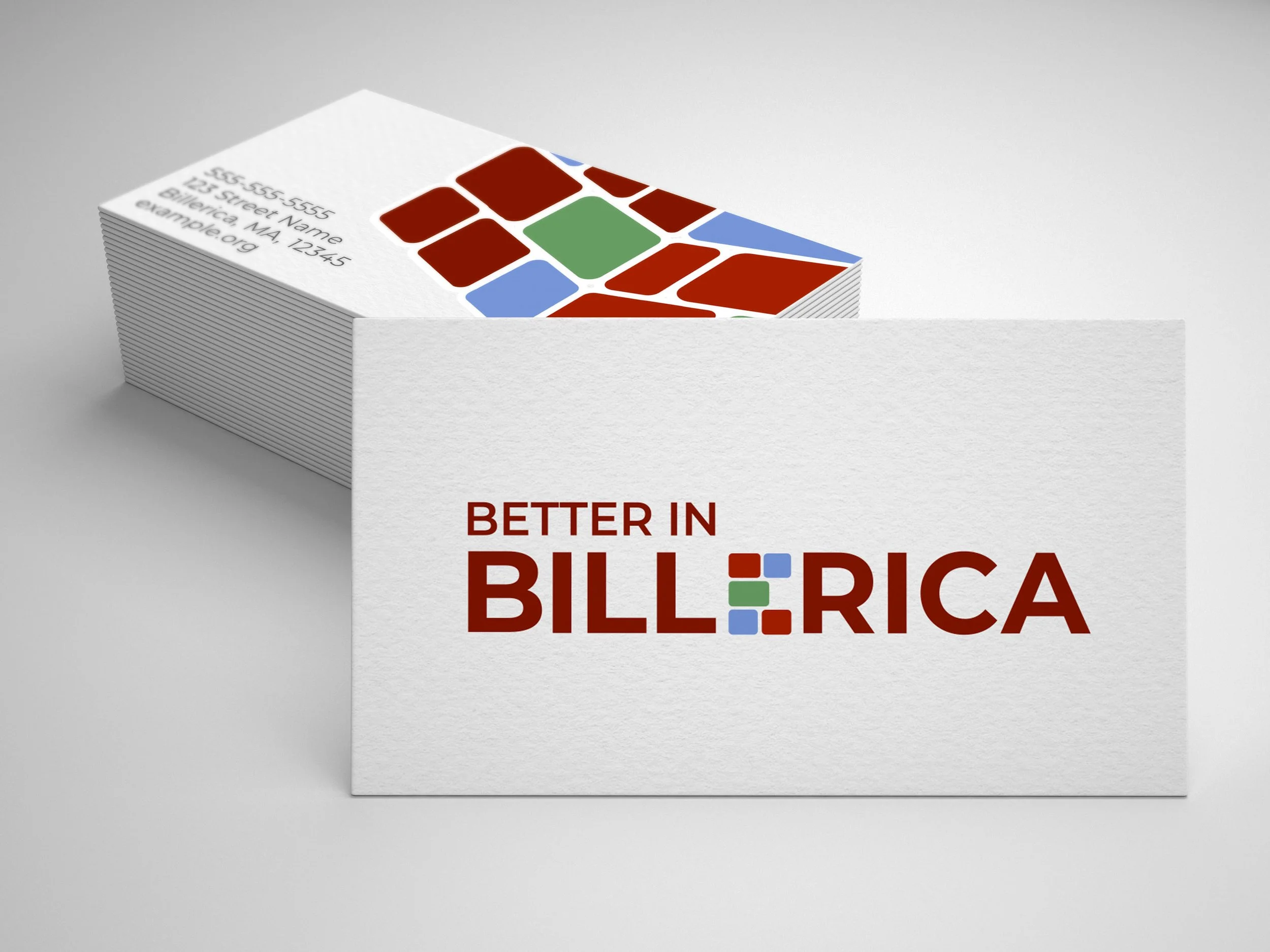
Using a modern, sans-serif font and a refreshing selection
of color, Billerica’s Economic Development Logo was created to represent the history, as well as the future of the town. Bricks represent their history as a mill town, but also symbolize building a bigger and better future.

Color
Billerica Brick Red
HEX #7B2416
Accent Red
HEX #9D3325
River Blue
HEX #8097CD
Open Space Green
HEX #73996F
Typography